Summary
This blog explores the importance of responsive design in modern website development. It explains the core principles, benefits, and implementation strategies, empowering web developers to create websites that adapt seamlessly to various screen sizes and devices.
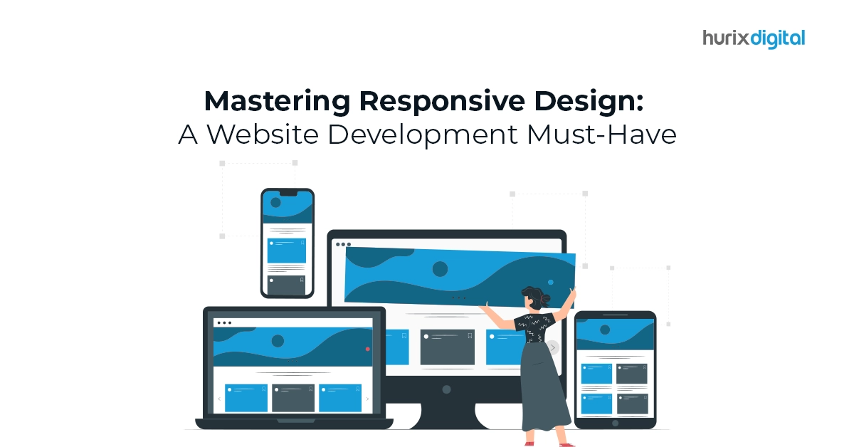
In today’s digital age, users access websites from a diverse range of devices, from desktops and laptops to tablets and smartphones. To cater to this ever-evolving landscape, responsive design has become an essential aspect of website development. It ensures your website automatically adjusts its layout and elements to deliver an optimal viewing experience on any device, regardless of screen size or resolution.
Table of Contents
- Why is Responsive Design Crucial for Website Development?
- Mastering the Principles of Responsive Design
- Putting Responsive Design into Practice
- Advanced Responsive Design Techniques
Why is Responsive Design Crucial for Website Development?
Here are some compelling reasons why responsive design is no longer an option but a necessity for web developers:
- Enhanced User Experience: Users expect websites to be easy to navigate and visually appealing across all devices. Responsive design eliminates the need for horizontal scrolling, zooming, and clunky layouts, providing a seamless and user-friendly experience that keeps visitors engaged.
- Improved Search Engine Optimization (SEO): Search engines like Google prioritize websites that offer a positive user experience on mobile devices. Responsive design ensures your website meets these criteria, potentially boosting your search engine ranking and driving more organic traffic.
- Increased Website Accessibility: Responsive design makes your website accessible to a wider audience, including users with disabilities who may rely on assistive technologies or specific screen sizes. This promotes inclusivity and ensures everyone can access your website’s content and functionality.
- Reduced Maintenance Costs: Maintaining separate websites for different devices can be time-consuming and expensive. Responsive design eliminates this need, allowing you to manage a single website that adapts to various devices, saving time and resources.
Also read, The Impact of Artificial Intelligence on Website Development
Mastering the Principles of Responsive Design
Implementing responsive design effectively requires understanding its core principles:
- Fluid Grid System: Utilize a flexible grid layout that adjusts automatically based on the available screen size. This ensures elements like text, images, and videos resize and rearrange themselves for optimal viewing on any device. Think of it as a stretchy container that can accommodate various content sizes without breaking the layout.
- Media Queries: Employ media queries, which are CSS code snippets that instruct the browser how to render the website layout based on specific screen size conditions. This allows you to define different styles and layouts for different screen sizes. Imagine media queries as switches that activate specific design rules based on the device being used, ensuring a tailored experience for each user.
- Responsive Images: Use images optimized for various screen sizes and resolutions. This prevents blurry or pixelated images on different devices and ensures fast loading times. Consider using techniques like image resizing, serving different image versions based on device capabilities, and leveraging lazy loading to optimize image delivery and improve website performance.
- Viewport Meta Tag: Utilize the viewport meta tag to control how the website’s initial viewport is set. This allows you to specify initial zoom, scaling, and orientation, influencing how the website is initially displayed on different devices. Think of it as providing initial instructions to the browser on how to frame the website content, ensuring a proper starting point for responsive adjustments.
- Breakpoints: Define specific screen sizes (breakpoints) where significant layout changes occur. This helps create smoother transitions between different device categories and ensures a well-defined responsive experience throughout the website. Imagine breakpoints as markers that trigger layout adjustments, creating a responsive design that adapts seamlessly across various screen sizes.
Read more: Website Development Trends to Watch in 2024
Putting Responsive Design into Practice
Here are some practical tips for web developers to implement responsive design:
- Start with a Mobile-First Approach: Design your website for mobile devices first, then progressively enhance it for larger screens. This ensures a smooth user experience on the most widely used devices.
- Utilize Responsive Frameworks: Consider using pre-built responsive frameworks like Bootstrap or Foundation, which provide ready-made components and styles that simplify the responsive design process.
- Test Thoroughly: Test your website across various devices and screen sizes using emulators and real devices to ensure consistent functionality and optimal viewing experience on all platforms.
Advanced Responsive Design Techniques
As you gain experience, explore advanced responsive design techniques like:
- Responsive Typography: Adjust font sizes and line heights based on screen size for improved readability on different devices. This ensures users can comfortably consume your content without straining their eyes, regardless of the device they’re using.
- Media Queries for Orientation: Create separate layouts for portrait and landscape modes on mobile devices to cater to different user preferences. This allows users to navigate and interact with your website seamlessly, whether they’re holding their phone vertically or horizontally.
- Responsive Menus: Implement navigation menus that adapt and transform based on screen size, ensuring easy access to website sections on all devices. Consider using hamburger menus or collapsible menus on smaller screens to save space and provide a clutter-free experience.
- Viewport Meta Tag: Utilize the viewport meta tag to control how the website’s initial viewport is set. This allows you to specify initial zoom, scaling, and orientation, influencing how the website is initially displayed on different devices.
- Performance Optimization: Remember that responsive design shouldn’t compromise website performance. Optimize images, minimize HTTP requests, and leverage caching mechanisms to ensure your website loads quickly and delivers a smooth user experience across all devices.
Also read, Mobile-First Revolution: Adapting Your Website Development Strategy
Conclusion:
Mastering responsive design is an ongoing journey that requires continuous learning and adaptation. By staying updated with the latest trends and embracing new technologies, web developers can create websites that not only look visually appealing but also provide an exceptional user experience on any device.
Here are some additional takeaways to remember:
- Responsive design is not a one-size-fits-all solution. Carefully consider your target audience and their device usage patterns when implementing responsive design strategies.
- User testing is crucial. Throughout the development process, involve real users with various devices to test your website’s responsiveness and identify areas for improvement.
- Accessibility should always be a priority. Ensure your responsive website adheres to accessibility guidelines and best practices to cater to users with disabilities.
By prioritizing responsive design and its core principles, web developers can empower their clients to reach a wider audience, engage users effectively, and achieve their business goals in the ever-evolving digital landscape.
At Hurix Digital, our team of experienced web developers possesses extensive knowledge and expertise in crafting responsive websites that deliver exceptional user experiences across all devices.
Contact us today for a free consultation and let us help you build a website that not only looks stunning but also adapts seamlessly to the ever-changing digital landscape.