Summary
This article is designed to help you understand typesetting and its importance in web design. It will also help you understand the balance between legibility and aesthetics in typesetting.
We have all encountered an image CAPTCHA (Completely Automated Public Turing test to tell Computers and Humans Apart), a security measure on websites and apps. Sometimes, deciphering them can get complicated.
Some designs, although aesthetically pleasing, can have a similar effect. They are great to look at, but reading them can be complicated and unnerving.
Due to these factors, web accessibility is still a big challenge for most enterprises, as 96.8% of websites failed the basic WCAG (Web Content Accessibility Guidelines) 2 test.
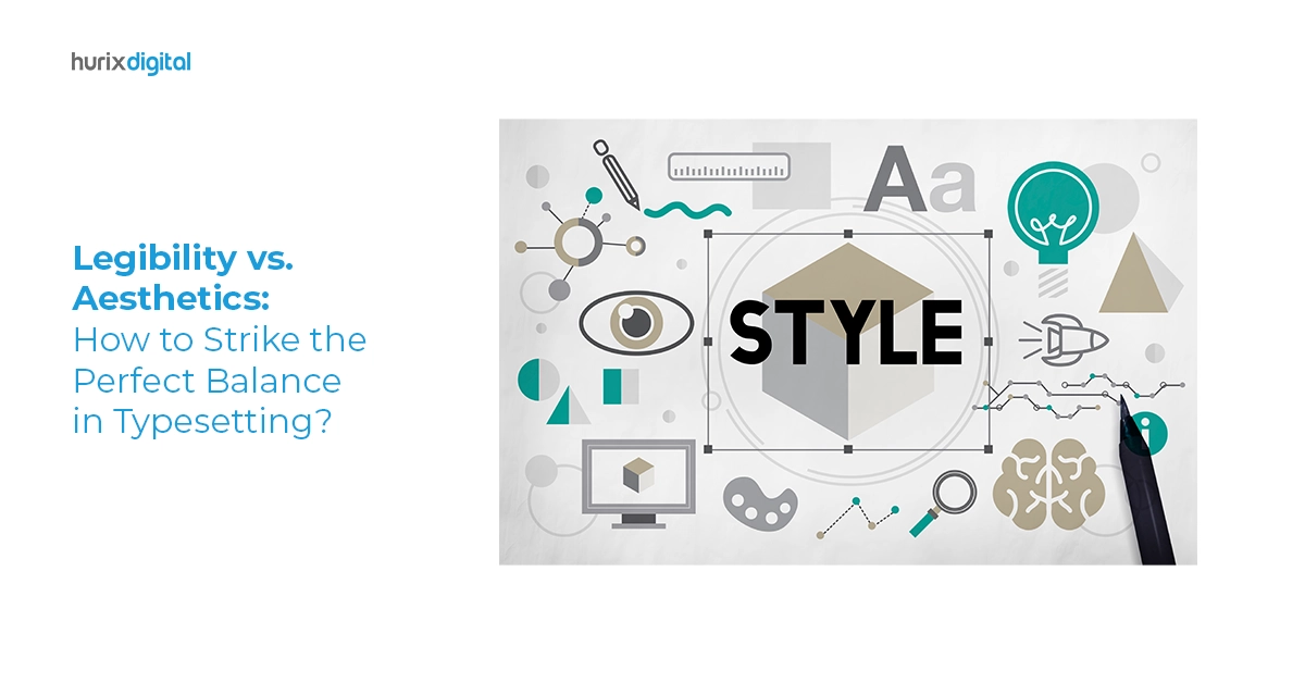
This complexity in deciphering words in a design is called legibility. It forms a crucial aspect of any design and is the basis for any typesetting or font selection. This is where the legibility vs. aesthetics problem kicks in.
Table of Contents:
- Understanding Typesetting and Its Importance in Publishing
- The Significance of Legibility
- The Role of Aesthetics
- Tips for Interplaying Aesthetics and Legibility
- Conclusion
Understanding Typesetting and Its Importance in Publishing
Let’s begin to answer this problem by first understanding what typesetting is.
Typesetting is the art and practice of arranging and formatting text in a visually appealing and readable manner. It involves selecting appropriate fonts, determining font sizes, adjusting line spacing (leading), controlling letter and word spacing (kerning and tracking), and organizing text on a page or screen.
Typesetting plays a crucial role in various forms of visual communication, including print media, web design, advertising, and publishing. By understanding the rules of typesetting, designers can understand various concepts in publishing, such as:
- Readability or Legibility – The ability to make text easily readable
- Visual Hierarchy – Which font, color, design, or element to use and how
- Branding
- Aesthetics – What emotion does the design convey, what tone, what impression
- Accessibility
- Cohesiveness
The Significance of Legibility
Legibility in typesetting is akin to clarity in speech. It’s the cornerstone of effective communication. It refers to the ease with which written or printed text can be read and comprehended.
Taking into consideration the legibility or readability of a design has several benefits:
- Legible text ensures that readers can effortlessly navigate through content.
- Illegible or poorly typeset text places an unnecessary cognitive burden on the reader. This extra effort required to decipher the content can lead to frustration and reduced engagement.
- It ensures that individuals with varying visual abilities can access and understand the content. Meeting accessibility standards is ethical and expands the message’s reach to a wider audience.
- Legibility is closely associated with trust and credibility in professional and academic contexts. Well-structured, legible documents convey a sense of authority and competence. On the other hand, illegible content may be perceived as unprofessional or unreliable.
- Legibility reflects attention to detail and commitment to quality for businesses and brands. Consistently legible branding materials, such as logos and marketing collateral, contribute to a positive brand reputation.
The Role of Aesthetics
Aesthetics is equally important in design, as the allure draws you to a particular artwork. It’s the visual appeal and creative flair that typography brings to a message.
While legibility ensures clarity, aesthetics elevate text from mere words to a captivating visual experience. Getting the aesthetics right can also benefit you in many ways. They are:
- Aesthetically pleasing typesetting grabs the viewer’s attention and holds it. Whether through elegant serifs, modern sans-serifs, or creative display fonts, aesthetics can evoke emotions, set the mood, and enhance the overall impact of a message.
- Aesthetics are integral to establishing and reinforcing brand identity. Font choices, color schemes, and typographic styles become synonymous with a brand, making it instantly recognizable.
- Aesthetically pleasing design, including typography, contributes to an improved user experience. It makes content more enjoyable, whether in print, on a website, or in an app.
Also Read: Enhancing Design and Readability with AI-Powered Typesetting
Tips for Interplaying Aesthetics and Legibility
To help you get the ideal readability for your documents or eBook, publications often use professional typesetters who can turn a normal document into an appealing yet highly legible piece of text.
Wondering what a typesetter is or what typesetting companies can help with? Achieving the perfect balance between legibility and aesthetics is exactly what typesetting services are all about.
To help you strike that equilibrium, here are some practical tips and techniques:
1. Focus on Legibility First
Choose fonts that are legible and align with the message and brand. Depending on the purpose and type of publication, you can select fonts that blend perfectly with the design.
For example, Sans-serif fonts like Arial or Helvetica are often more readable on screens, while serif fonts like Times New Roman work well in print.
Experiment with font pairing for added visual interest.
2. Typeface Size
Pay attention to font size, which also plays an important role in aesthetics. If the heading and the main text are mismatched, it will derail the entire design.
For body text, a general guideline is to use 10-12 points for print and 16-18 pixels for digital. Headings can be larger, but you should maintain consistency throughout the design.
3. Spacing and Kerning
Adjust letter and word spacing (kerning and tracking) to ensure characters are neither cramped nor loose. Proper spacing aids legibility without compromising aesthetics.
4. Focus on Contrasts
Ensure sufficient contrast between your design text and background colors. High contrast enhances legibility. For instance, dark text on a light background enhances readability and vice versa.
To get the perfect contrast, designers should test different color combinations for readability, especially for users with visual impairments.
Choosing the right typesetting and design can aid in accessibility, making it crucial for taking your materials to include all users, even those with disabilities.
5. Limit Variations
Avoid using too many fonts or variations within a design. Stick to a cohesive font and color palette to maintain consistency and prevent visual clutter.
A good rule is to use no more than three fonts: one for headings, one for subheadings, and one for body text. The same applies to colors; ensure they follow the brand guidelines and there aren’t too many variations.
6. Follow the Principles of Responsive Design
Consider how typography and designs adapt to different screen sizes and devices in web design. This requires a basic design understanding and needs testing on multiple devices.
Following basic responsive design principles, the same fonts, colors, or designs can make sense on multiple devices and platforms without being distorted or cropped, losing character.
These tips can seem challenging, but new technologies are helping make this a lot easier. There are AI-based typesetting software or LaTeX typesetting tools that can automate and make this process more streamlined and efficient.
So the next time you are unsure of selecting your formatting options or wonder who wins the LaTeX vs. Word debate, you can decide based on your specific needs.
While some formatting options are available in systems like Word or Google Docs, LaTeX offers an edge. LaTex offers customizable features ideal for designing an eBook, online magazine, or digital publication.
Also Read: Exploring The Future of AI in Typesetting Services
Conclusion
The typesetting world is like a visual playground where art and science converge. It’s a space where words transcend mundane forms and become vehicles of emotion, persuasion, and knowledge.
As designers, we hold the power to shape this world, to communicate ideas, and to leave indelible marks on those who encounter our work. The ultimate battle is striking the perfect balance between these two forces.
If you are looking for a company to get professional typesetting services, Hurix Digital is the ideal option. With our state-of-the-art AI digital publishing platform, you can get the right combination of in-house LaTeX typesetting services and consultancy to get the perfect typesetting and interior page layout for your publication.
Get in touch with Hurix Digital to know more!